 All stories


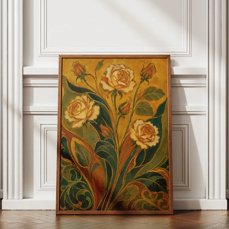
Here is the uncomfortable truth about wall-art shopping: poster, art print, and giclée are not quality tiers. They are production terms, and none of them is legally regulated, yet listings price them as if the words themselves guaranteed something. A "giclée" made with the wrong ink on the wrong paper can fade faster than an honest poster, and an "art print" can be anything from museum-grade to a photocopy with ambitions.
What actually decides whether a print still looks good in ten years is a short list of unglamorous specs: the ink, the paper, and where the thing hangs. Once you know how to read those, the fancy vocabulary stops being intimidating and starts being useful, whether you are buying a botanical poster for a rental kitchen or having a custom portrait printed as a gift that is supposed to outlive the occasion.
The Short Answer
A poster is a mass-run print on lighter paper, made to be inexpensive decor; expect it to fade sooner and frame it casually. An art print is an unregulated term, so ignore the label and ask what ink and paper were used. A giclée, used honestly, means pigment-based inkjet on archival stock, which is the combination built to last decades behind glass. For anything sentimental, especially custom art, insist on pigment inks and acid-free paper, whatever the listing calls itself.
The Three Words, Decoded
A poster is produced on an offset or digital press, usually on relatively thin coated paper, in large runs. That is not an insult; it is a format. Posters exist so that a striking image can cost little, and for a dorm, a kid's room, or a look you plan to change next year, they are exactly right.
An art print is whatever the seller wants it to mean. Sometimes it is a genuinely archival print; sometimes it is poster stock with a better photograph in the listing. Because the term carries no standard, the listing has to earn your trust with specifics: what printer process, what ink, what paper.
Giclée entered the vocabulary in the early 1990s to describe fine-art inkjet printing. Used properly, it means pigment inks sprayed at very high resolution onto archival paper or canvas, typically cotton rag or alpha-cellulose stock. But the word itself is also unregulated, so treat it as a claim to verify rather than a certificate: a listing that says giclée and also names the ink type and paper is credible; one that says giclée and nothing else is just using French.
Ink and Paper Do the Real Work
Two kinds of ink dominate. Dye inks soak into the paper coating and produce vivid color inexpensively, but they are the less lightfast option and fade noticeably faster, especially in sunlight. Pigment inks deposit microscopic solid particles that are far more stable; framed under glass and kept out of direct sun, a pigment print on good paper is a decades-scale object. If a listing names its ink at all, that is already a good sign; if it names pigment ink, better still.
Paper decides the rest. Acid-free and lignin-free stock resists the yellowing and brittleness that cheap wood-pulp paper develops, which is why archival papers carry those labels. Weight is a useful proxy: poster stock is thin and flexible, while fine-art papers are noticeably heavier and stiffer. Surface is taste rather than quality: matte cotton rag flatters illustration and portraits and kills glare; luster and gloss deepen photographic color but reflect every window in the room.
Other Methods Worth Recognizing
Screen prints are made by pushing ink through a mesh stencil, one screen per color. The result is a physical layer of flat, saturated ink you can often feel, and small runs printed by hand are collectible in their own right. Risograph prints come from a stencil duplicator that lays down spot colors one at a time, with a slightly grainy texture and charmingly imperfect registration; they are loved for exactly those quirks, not for archival performance. Canvas prints are usually the same pigment inkjet process applied to coated canvas, then stretched; they skip the glass and frame but live or die by their protective coating. And printing does not stop at paper: the picks under this story stretch from a wall poster to printed bags, a reminder that "print" describes a process applied to almost any surface.
Choose for the Wall It Will Hang On
The decision framework is four questions. First, how much light hits the spot? Direct sun is the great destroyer of prints; for a bright wall, you want pigment ink and UV-filtering glazing, or you want a poster you will not mourn. Second, how long should it last? A seasonal refresh argues for posters; a piece tied to a person or a memory argues for archival everything. Third, what is the framing budget? A good frame with an acid-free mat often costs as much as the print, and it is wasted on poster stock just as cheap framing squanders an archival print. Fourth, is the image replaceable? A pattern from an open edition can be reordered forever. A custom portrait or caricature made from your photos cannot be casually replaced, which is why custom work should default to the archival end of every choice above.
What to Look For (and What to Skip)
Look for:
- A named ink type, ideally pigment or archival ink, stated in the listing.
- A named paper: weight, acid-free, cotton rag or similar, rather than just "premium paper".
- Edition information when buying limited work: the print's number, the edition size, and a signature.
- For custom pieces, confirmation that your source photo has enough resolution for the print size you want.
- Sellers who describe their printing process unprompted; specificity is the honest tell in this category.
Skip:
- "Museum-quality" and "gallery-grade" with no specs attached; these phrases are decoration.
- Limited editions with enormous or unstated edition sizes, where the limit does no limiting.
- High-gloss paper for large framed pieces in bright rooms, unless the recipient enjoys looking at reflections of their lamp.
- Listings that will not say what paper they print on.
- Hanging any print, at any price, in direct sunlight without UV-protective glazing.
Where the Money Actually Goes
At the entry tier you are buying image and scale: open-edition posters on decent stock that make a big visual impact for little money, perfect for home decor that follows your taste as it changes. The solid tier is a pigment print on archival paper from an independent shop, which is where most art and collectibles listings worth keeping sit; you are paying for materials that will not betray the image. The heirloom tier is signed limited editions, hand-finished work, and commissioned custom art printed archivally, where the cost reflects the artist's hand and the piece's permanence. One quiet rule across all tiers: budget for framing at the same level as the print, because the mat and glazing are part of the object's lifespan, not an accessory.
Mistakes People Make
- Judging by the word instead of the specs. Fix: ignore poster versus giclée and read for ink, paper, and edition.
- Framing an archival print with a cheap acidic mat, which can discolor the paper it touches over the years. Fix: ask for acid-free matting; it is standard at any decent framer.
- Hanging a treasured print opposite a sunny window. Fix: move it to a shaded wall or pay for UV-filtering acrylic.
- Ordering a large custom print from a small phone photo. Fix: send the highest-resolution original you have and let the seller confirm the maximum clean size.
- Paying a limited-edition premium for prints with no numbering, no signature, and no stated edition size. Fix: no documentation, no premium.
What does giclée actually mean?
The term was coined in the early 1990s to give fine-art inkjet printing a name of its own. In honest use it means a high-resolution inkjet print made with pigment inks on archival paper or canvas. The word itself is not regulated, so anyone can print it in a listing; treat it as shorthand that still needs backing from the real specs, namely pigment ink and acid-free stock.
Do art prints fade over time?
All prints change eventually, but the speed varies enormously. Dye-ink prints on ordinary paper can fade visibly within a few years in a bright room. Pigment-ink prints on archival paper, framed under UV-protective glazing and kept out of direct sun, hold their color for decades. Light exposure is the biggest single factor you control, so placement matters as much as printing.
Is a canvas print better than a framed paper print?
Neither is better; they are different objects. Canvas skips glass and mat, weighs little, and suits large casual pieces, but its surface texture softens fine detail and it depends on its coating for protection. Paper behind glass preserves detail and is easier to protect from light and dust, at the cost of glare and framing expense. For detailed custom portraits, paper usually flatters the work more.
What should I check before ordering a custom portrait print?
Three things. Send the sharpest, highest-resolution photo you have, since the print can only be as good as the source. Confirm the piece will be printed with pigment inks on acid-free stock if you intend it to hang for years. And ask about the proof step, so you approve the artwork before it goes to print. Custom caricatures and portraits reward this small amount of diligence more than any other wall art.
Reviews & comments
See every public review for this Journal story and leave your own note.